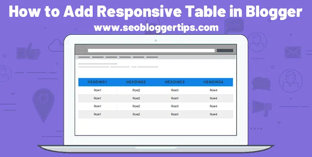
Add Responsive Table in Blogger Using HTML & CSS Code
Responsive Table in Blogger has rows and columns that make it easier to read
data. The row in the Responsive Table consists of several cells, and the cell
is the fundamental element of the table, and data is entered into it.
In this guide, you will learn how to create a responsive table in
your Blogger. A responsive table is necessary to display data on various
screens such as PC and mobile. The responsive table allows us to find our way
around a bunch of data and to find the data we need.
Each table has
rules according to which the data is arranged. Each column has a header in
which it is written, most often, an object that is described through columns
and rows. The columns and rows in the tables are separated by lines that form
a network of cells.
What is a Responsive Table?
The Responsive Table in Blogger is an HTML table that is flexible and customizable in any browser window size. The responsive table is displayed correctly on any device such as a desktop computer, tablet, laptop, and mobile device. A responsive table in Blogger allows to sort and search their rows directly using mouse movements or touch devices.
How to add a Responsive Table in Blogger
Go to Blogger Dashboard click on Theme> drop-down menu> Edit HTML
Press CTRL + F type </b: skin> and press Enter
Paste the CSS code above the </ b: skin> tag and Save Theme.
Responsive Table CSS Code:
/* Responsive Table */
table{border:1px solid #ccc;border-collapse:collapse;margin:0;padding:0;width:100%;table-layout:fixed}table caption{font-size:1.5em;margin:.5em 0 .75em}table tr{background-color:#fff;border:1px solid #e1e5e9;padding:.35em;border-radius:3px}table thead tr:first-child{border:1px solid #0f82e6}table td,table th{padding:1.625em;text-align:center;color:#000;font-size:14px;font-family:arial}table td:nth-child(4){font-size:14px}table th{font-size:.85em;letter-spacing:.1em;text-transform:uppercase;background:#0f82e6;color:#fff}table tbody tr td .btn-invoice{background:#0f82e6;color:#fff;font-size:14px;padding:10px 20px;border:0;font-family:arial}tbody tr:nth-child(even){background-color:#eee}tbody tr:nth-child(odd){background-color:#fff}@media screen and (max-width:750px){table{border:0}table caption{font-size:1.3em}table thead{border:none;clip:rect(0 0 0 0);height:1px;margin:-1px;overflow:hidden;position:absolute;width:1px;padding:0}table tr{border-bottom:3px solid #e1e5e9;display:block;margin-bottom:.625em}table td,table th{padding:.625em}table td{border-bottom:1px solid #e1e5e9;display:block;font-size:.8em;text-align:right;color:#9da9b9}table td::before{content:attr(data-label);float:left;font-weight:700;text-transform:uppercase;color:#656971}table td:last-child{border-bottom:0}table td:nth-child(4){font-size:.8em}}
*/
When we have finished implementing the Responsive Table CSS code in Blogger, it is now necessary to insert the HTML code of the table into the article you want.
Responsive Table HTML Code:
Whenever you want to use a responsive table in an article, you need to insert this HTML code into the post.
<table>
<thead>
<tr>
<th><label><span style="font-size: medium;">Blogger Heading1</span></label></th>
<th><label><span style="font-size: medium;">Blogger Heading2</span></label></th>
<th><label><span style="font-size: medium;">Blogger Heading3</span></label></th>
<th><label><span style="font-size: medium;">Blogger Heading4</span></label></th>
</tr>
</thead>
<tbody>
<tr>
<td data-label="Heading1">Row1</td>
<td data-label="Heading2">Row2</td>
<td data-label="Heading3">Row3</td>
<td data-label="Heading4">Row4</td>
</tr>
<tr>
<td data-label="Heading1">Row1</td>
<td data-label="Heading2">Row2</td>
<td data-label="Heading3">Row3</td>
<td data-label="Heading4">Row4</td>
</tr>
<tr>
<td data-label="Heading1">Row1</td>
<td data-label="Heading2">Row2</td>
<td data-label="Heading3">Row3</td>
<td data-label="Heading4">Row4</td>
</tr>
<tr>
<td data-label="Heading1">Row1</td>
<td data-label="Heading2">Row2</td>
<td data-label="Heading3">Row3</td>
<td data-label="Heading4">Row4</td>
</tr>
</tbody>
</table>
Responsive Table in Blogger Demo
| Row1 | Row2 | Row3 | Row4 |
| Row1 | Row2 | Row3 | Row4 |
| Row1 | Row2 | Row3 | Row4 |
| Row1 | Row2 | Row3 | Row4 |
What are the Benefits of Using Responsive Table in Blogger?
There are many benefits to using a responsive table, but I will list the more important ones.
- Product specification - with a responsive table, you help customers find the information they want with ease.
- Product or price comparison - Responsive Tables make it easy to compare products or prices by displaying information.
- Statistics - Using the Responsive table in blogger is a great way to display statistics for an article.
Conclusion
Using a responsive table makes your blog more professional and makes it
easier for readers to read the information you present.
If you
find this post helpful, share it with your friends on social media. If you
have questions, post them in the comments section, I will try to answer them
as soon as possible. Thanks for reading this article.


